 |
 |
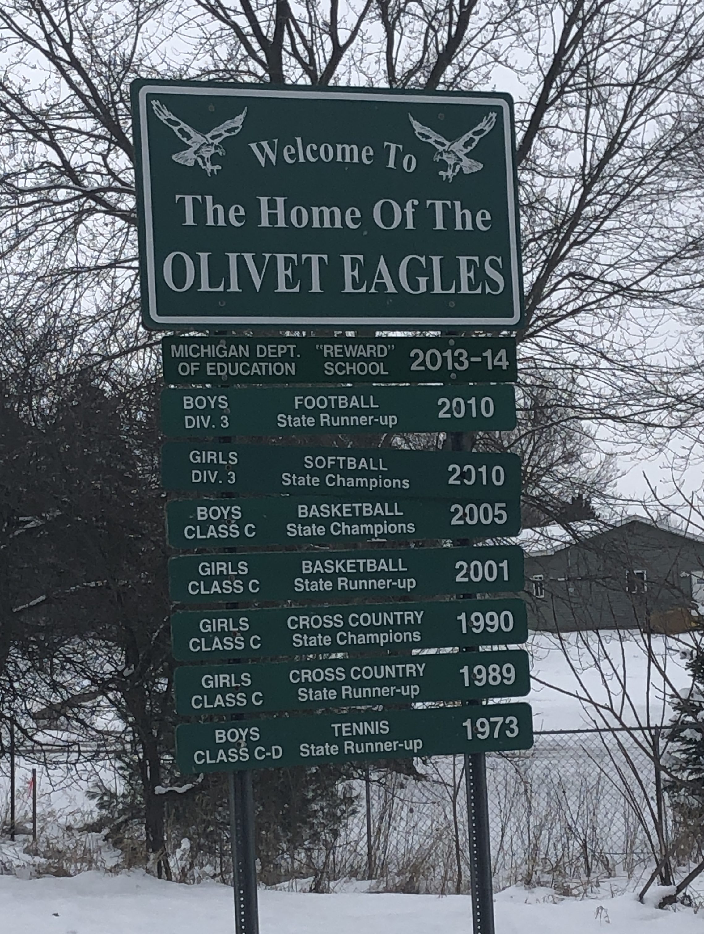
I like this sign a lot. (And maybe it’s time for a confession – when I find a sign I lean more toward the overall aesthetics and functionality of the sign more so than the content – with a few exceptions)
I like how each accomplishment has its own slit and how the slots follow a uniform pattern (Division, Accomplishment, Year)
I like how the mascot is on the sign.
I like how the most current accomplishment is at the top, although I imagine it is quite a pain in the rear end to take ALL of the signs off and move them down one notch.
The only thing I don’t like is the wording at the top. It’s not quite confusing but it is a little atypical. Maybe it’s me, but would it read better if it said: Welcome to Olivet Home of the Olivet Eagles.
Some other kinda’ related stuff: Olivet Athletics
———————————–
Do you have a business in Olivet? Advertise with us and get the word out to our adventurous readers.